It´s always great fun to name a ship. But also a big task: At least for me. A new boat´s name should not just be catchy and “nice”, but should also somehow reflect the boat´s character or at least have a kind of story attached. Something that helps to make a connection: A boat is a true family member, like a dog I would say. A focal point for our desires and dreams. A name should incorporate all of these, coming up with one of the usual suspects is a no-go, at least for me.
What´s a proper name for an icon?
So, what could be the new name for my Omega 42? I am thinking about this regularly, latest since I´ve watched the hull of my boat being transported into the building shed some moths ago. Since I saw her in all her glory and beauty: This is not just a sailboat, this is an icon!
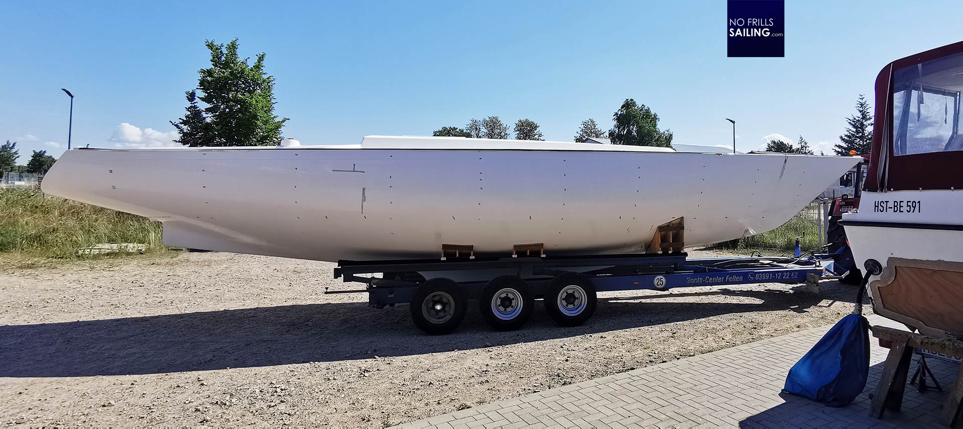
There is a second aspect to it: My kids. As a dad, I try to excite my kids for sailing and want them to have fun coming with me, want them to find interest in hoisting the sails and go out. I think this is something kids should do, learn about the physics of sailing, about nature, the ocean, the animals and the weather. Since my first ever boat I am trying to make them taking part in all processes. Having a vote in deciding for the ship´s name is great fun for them, stimulating their creativity and fostering a connection to the new boat. So, how to start?
Iconic, indeed
I´ve written many articles here about the Omega´s status of being an icon of sailing. So, naturally, I started with her history and her very name. “Omega” indeed is a loose class of sailboats, not all designed by Peter Norlin but all have those classy, beautiful lines in common, all sailing under the nice blue/white Omega-class logo. So, instead of searching databases of female names and just hope one of them would ring a bell, I looked at the Omega itself.

Omega is a letter in the Greek alphabet. There is a certain tone to the word itself, a kind of mythical connotation. But also something modern, something futuristic: Remember “The Omega-Man”? Indeed a great name for a boat´s brand or sailboat class. Naturally, when having Omega in mind, there´s the Alpha right away too. And here we are: Alpha and Omega. The ancient tradition of symbolizing the start and the end, the cycle of life, the A to the Z. Something that is deeply rooted in our traditions, something, that feels familiar, but also far away.
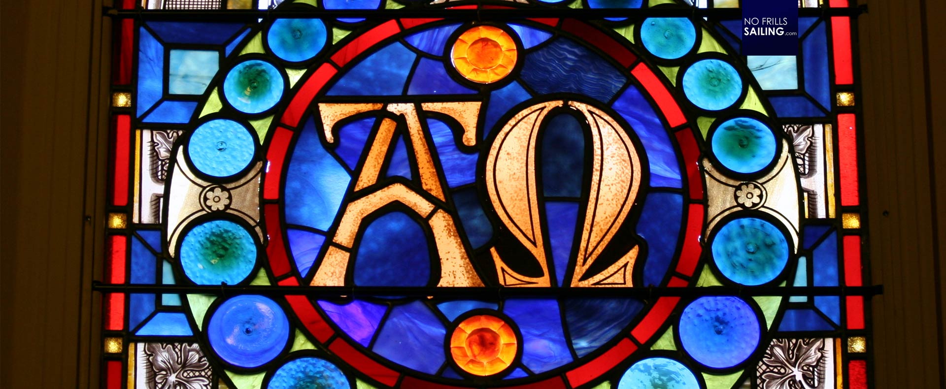
The “Alpha and the Omega”. The making and the annihilation. I like this. I also like the idea of naming the boat ALPHA as she indeed is an Omega. Checking with my kids (who by the way love the animated series of 2010 about two wolves, sweet stuff!) they liked it too. A catchy, short, great name. It has a deeper meaning and many facetes to it, but first of all, it is a name that sticks. I tried many other: I tried to find a nice Swedish name, German names and even the name of my “last” boat (which I won´t disclose). But this one “supername” did also not feel right for the Omega 42. And so we decided that ALPHA would be it. What a ride!
The fun of finding the fitting font
Now that we have found the name, several other tasks pop up. You might have read my article on the very same topic a few months ago: I haven´t had decided at that time to go for the Omega 42 but instead favored the First 36. My quest for a great design for such a yacht can be read there. The same way we enjoy food that has been arranged in a nice way, we enjoy to look at a boat with not just a name on bit a nice font, colors and styles.
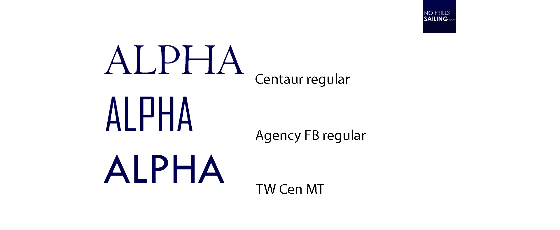
In this, I played around with Photoshop while and – at least for now – narrowed the hundreds of fonts down to three. ALPHA, in relation to the Greek and Christian mythology, could be printed with a font called “Centaur” (which would make for another great name, by the way). The font reminds of old stone carvings, amphoras with Greek gods and heroes wrestling and the “taste” of the Odyssey. Another connotation, pointing in the opposite direction of time, is the modern “Agency” and “TW Cen”-font. Both are sleek, very clean and fit the name nicely. “Agency”-font is long, kind of stretched, very sleek – just like the Omega 42 hull, seen from above. The other font stands wider, broader, conveys a futuristic look: As I want to combine the classy design Norlin´s hull with modern elements, this could suit as well.
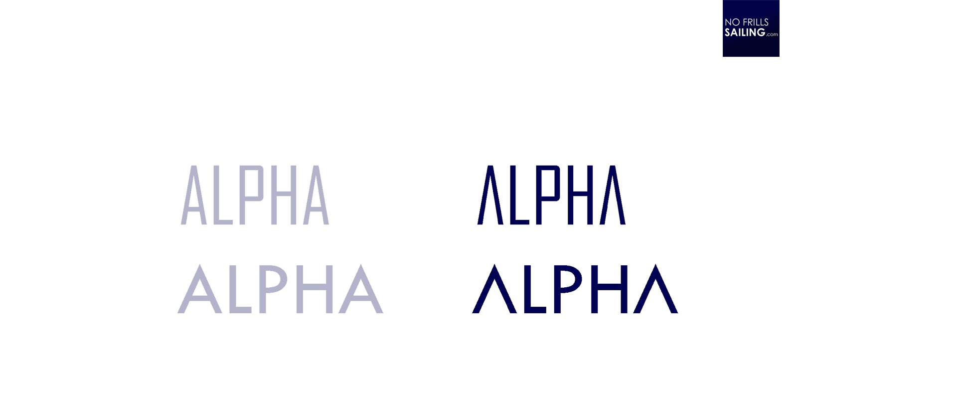
I also played around to add (or in this case: to take away) a kind of personal note. This time I surely don´t want replace one character in the word ALPHA with a graphic design, just as I did with GEKKO or LIMÓN. I thought, if I´d just erase the “girder” of the “A” this would enhance the futuristic look and add individuality. Not sure if this works for the slim “Agency”-font, but I like it with the wider font. I´m really not sure about the font I choose in the end, but as it is a work-in-progress, this is how I proceed.
Where to put the name stickers?
Next is the very location of the name stickers. For commercial and bigger ships those have to go to the bow, for sure. On sailboats I don´t like this very much. It just looks off, exaggerated. Also, most yachts have a trim strip all along the hull which normally starts at the bow with the logo of the brand or an arrow. Placing a sticker here just destroys the looks, takes away the focus of the trim-elements and sometimes there´s a visual “fight” for attention between those two. So, the ship´s name has to go to the stern.
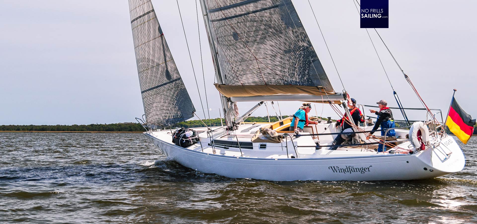
As for WINDFAENGER, the hull #001 of the Omega 42 evo-Project, the owner Stefan decided to have the name sticker to both sides of the stern section. I´ve seen many pictures of other Omega 42 yachts as well sporting their names on this location. It surely is a very eye-catching place to put it and certainly makes visual identification extremely easy for anyone when the boat is sailing. So let´s try it out …
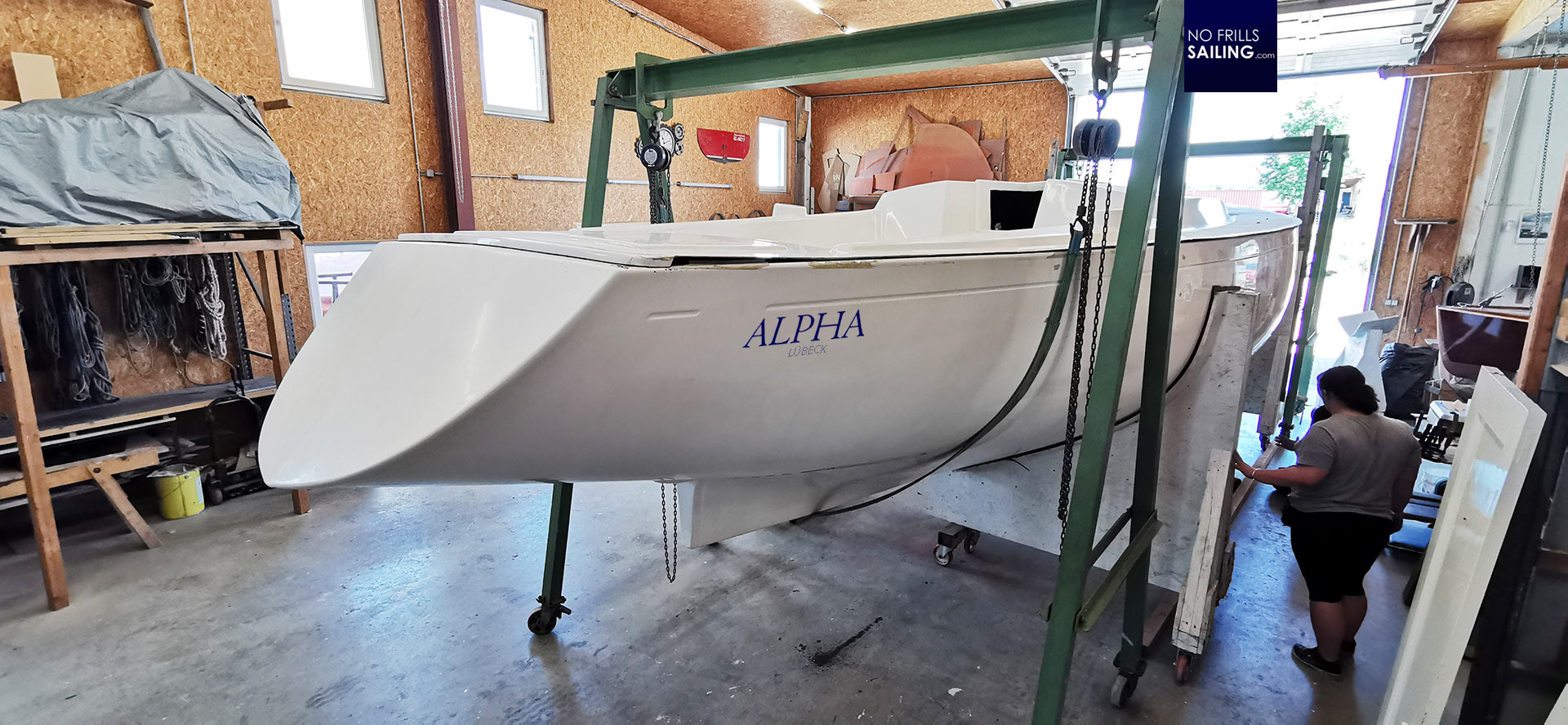
On the picture above you can see that the name looks okay on this location, but I refrained from utilizing the whole area available. I just don´t want the stickers to be too big: As much as I liked the “Boom!”-effect of the stickers and the size used for GEKKO, this is not the style that is fitting the elegant lines of an Omega 42. So I shrunk the name to a size that still looks okay. But anyway, as you can see in the picture, the name will be put into “visual competition” with the trim line – and I damn sure want my trim line (and waterline) in the classy blue colors. So, let´s try it out on the transom.

I would say it looks much, much better on the transom. Also, not too large as to not destroy the exciting size of the huge overhang, but in a nice ratio name to transom-area. I really like it! I will go on playing around and trying out to put the stickers a bit deeper, more to the middle of the transom area, but I would say that this location rather than the stern-sides is set and decided upon.
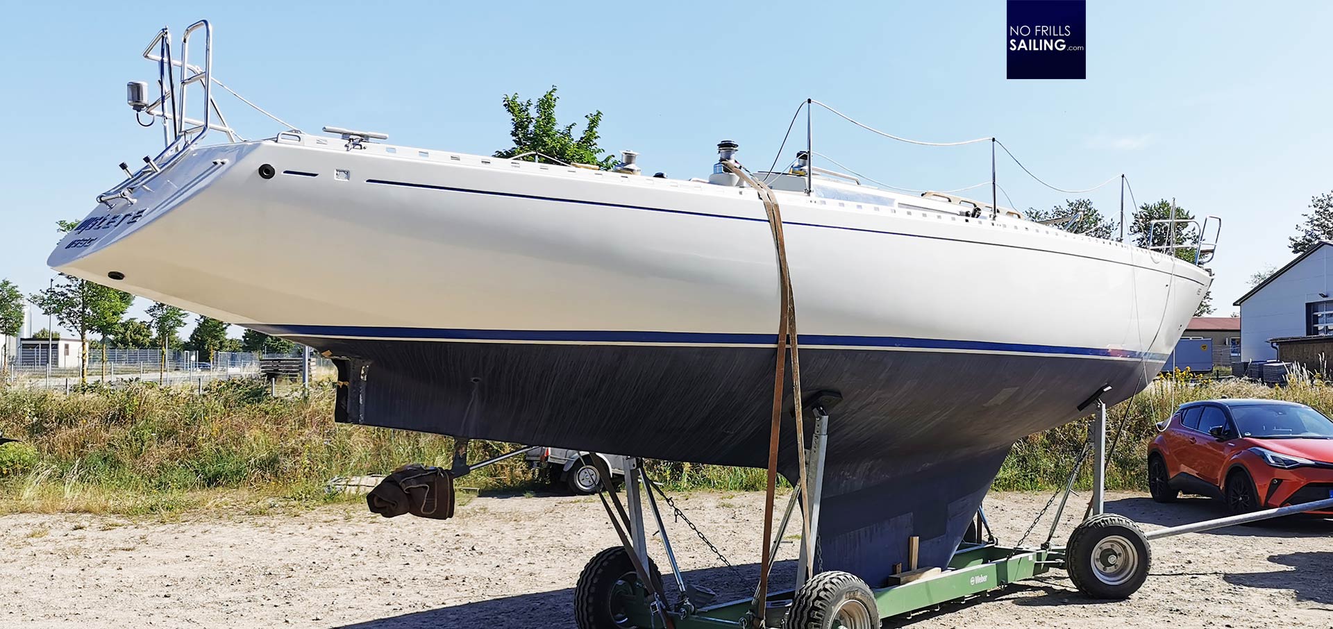
As you may see on the picture of this classic Omega 42, there are some more things to consider: Like the bathing ladder. I surely need one but I don´t want to have a folding ladder permanently fitted to the transom. It also just destroys the clean looks and takes away attention from the masterful gracious lines of Peter Norlin. Also, this very boat has her name sticker put underneath the ladder, which I do not like even more. Maybe I go for a clip-in ladder (which can also put along the hull´s side) and keep my hull nice and clean, just as this boat.
The importance of a proper ship´s name
„What´s all that fuzz about?!”, you may think now. Just get some inspiration and give her a name. Well, it´s more than that. The ship´s name is of utmost importance for me. Just as we had taken so much care to find our kid´s names, the boat is kind of the same. ALPHA, just as GEKKO and before her OLIVIA will be the focal point of our family and thus a full family member. Wasting the chance to give her a proper, fitting name that instills pleasure anticipation, the longing for quality family time and sailing adventures within my kids.
XXXXXXBILD alt GEKKO, Hotshot, madcap, Limon – kinder, familienmitglied
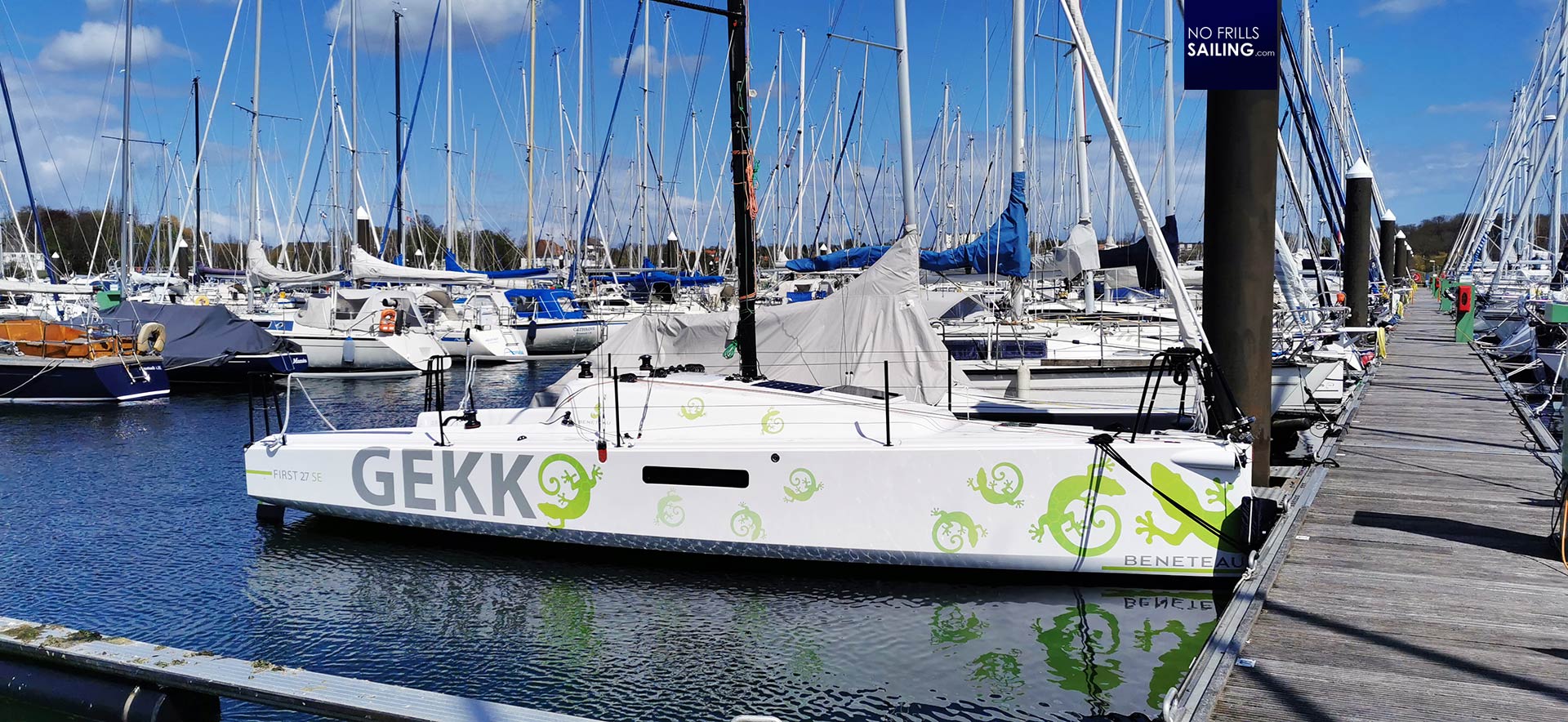
There are still so many details to think through and take care of. Like the waterline and trim strip (should I stick to classy blue or do something new?), like colors in general: Matching the name stickers with the colors of the Gennaker and even with elements of her interior design. As I said, it´s a work in progress and surely it´s not the last word spoken – but definitely one of the most fun things to do when a new boat is going to arrive.
You might also find interesting to read:
MADCAP is in the water!
Finding the right ship´s name
Designing GEKKO


